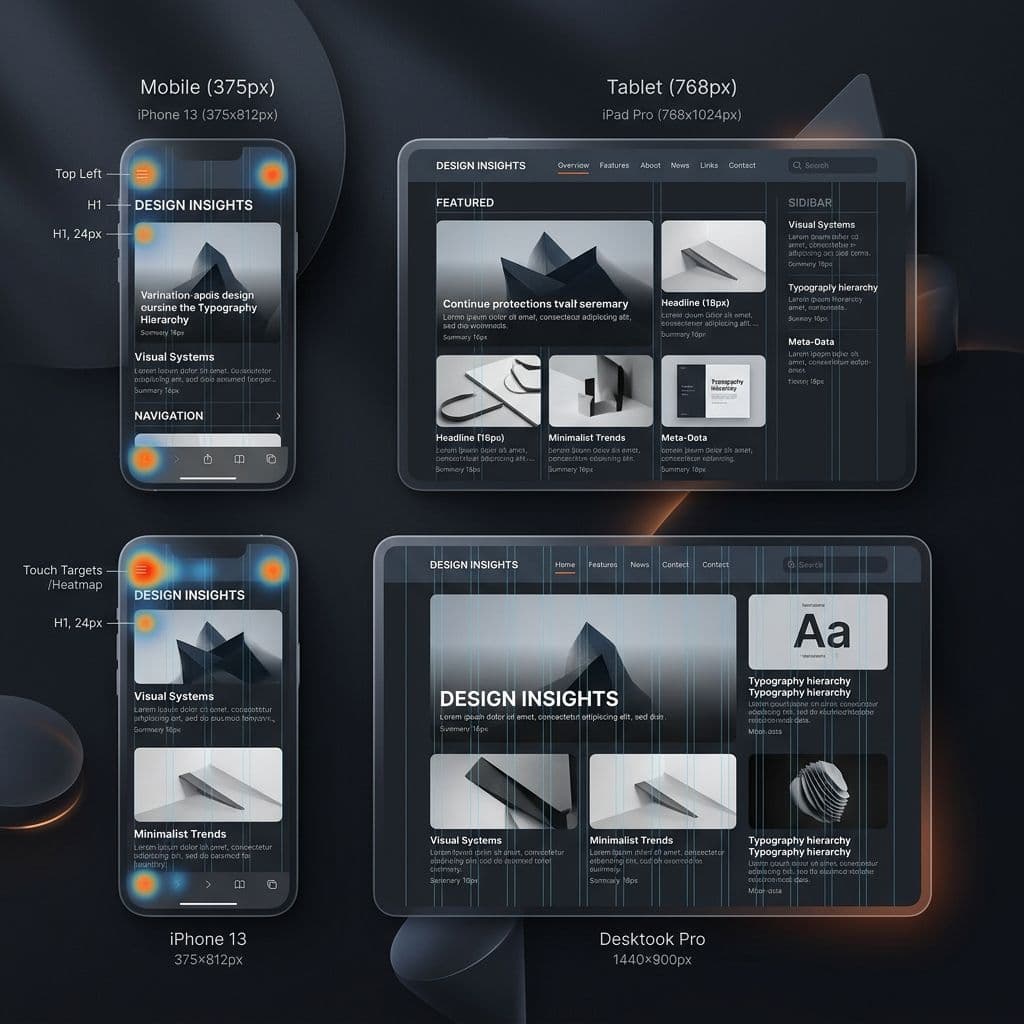
Mobile-First Responsive Layout & Touch Target Grid
Designing user interfaces across mobile (375px), tablet (768px), and desktop (1440px)
Mobile (375px–430px)
Thumb-zone buttons (48px+ height), single column stack, sticky action bars.
Tablet (768px–1024px)
Dual column grid, collapsible navigation drawers, touch & click dual support.
Desktop (1440px+)
Multi-column dashboards, sticky navigation sidebars, hover state micro-interactions.
Since a large portion of web traffic comes from mobile devices, mobile-first design is essential. Here are key principles for mobile layouts.
Touch-Friendly Targets
Design buttons and input fields large enough for easy tapping, and ensure there is adequate spacing between links to prevent misclicks.
Planning to Build Something Similar?
Tell us about your project requirements. Nexyn Studios builds high-performance custom software, CRMs, and scalable web applications engineered for business growth.
Nexyn Studios Engineering & Product Team
Nexyn Studios is a premier custom software engineering agency in Mumbai, India. We architect high-performance web applications, cross-platform mobile apps, custom CRMs, and scalable enterprise automation systems.
Related Engineering Articles
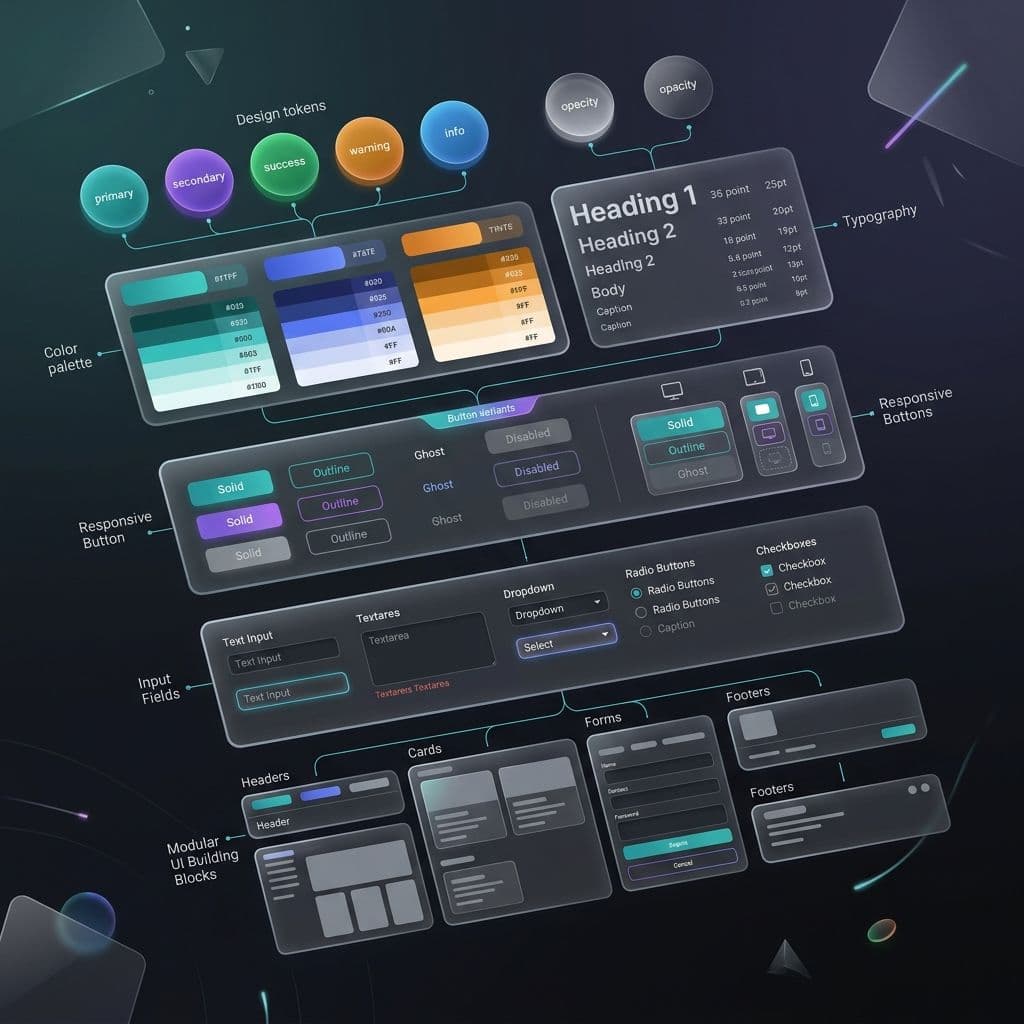
How a Design System Can Cut Your Development Time by 40%
A well-structured design system isn't just for designers. Here's how it accelerates development, reduces bugs, and maintains consistency across products.
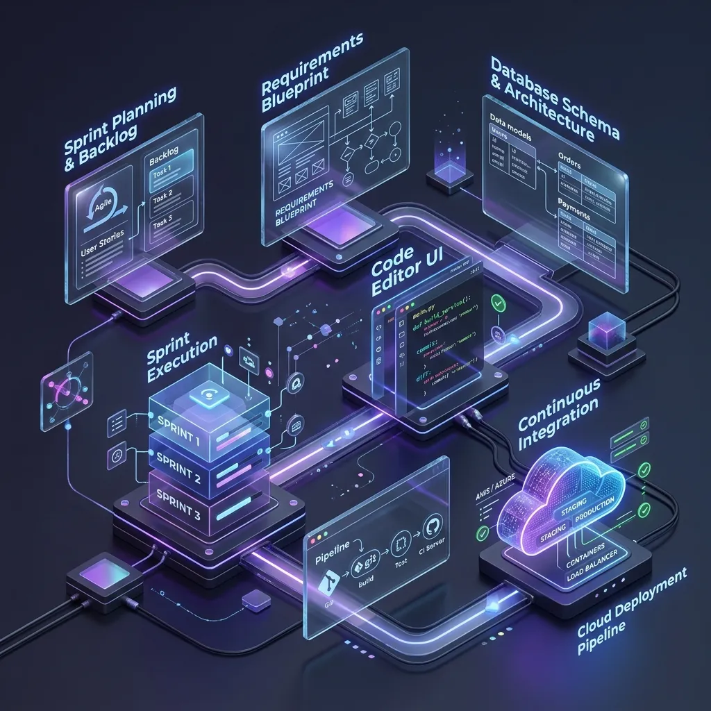
Best Custom Software Development Companies in Mumbai: How Businesses Should Choose the Right Partner
Mumbai businesses move fast. Learn how to compare custom software development companies in Mumbai and choose the right partner for CRMs, web apps, mobile apps, and automation.
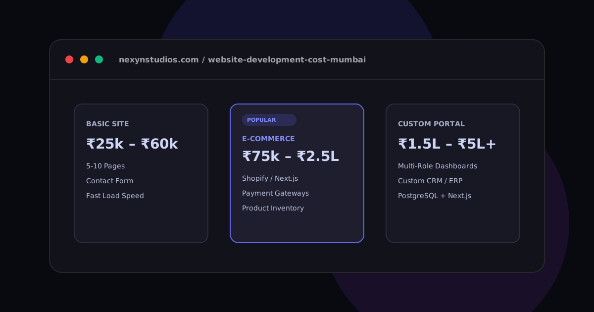
Website Development Cost in Mumbai: 2026 Pricing Guide
What is the true cost of building a website in Mumbai? We break down estimated rates for simple portfolios, Shopify/headless e-commerce storefronts, and custom React web apps.